↳ Mission & Values
↳ Meet the Editors
↳ Submit!
Spring 2023
(Fall 2018 )
Archive
Follow Us
Dangling Threads: Questions on Clarity, Capital, and Design Pedagogy
Everett Epstein
→ MFA GD 2021
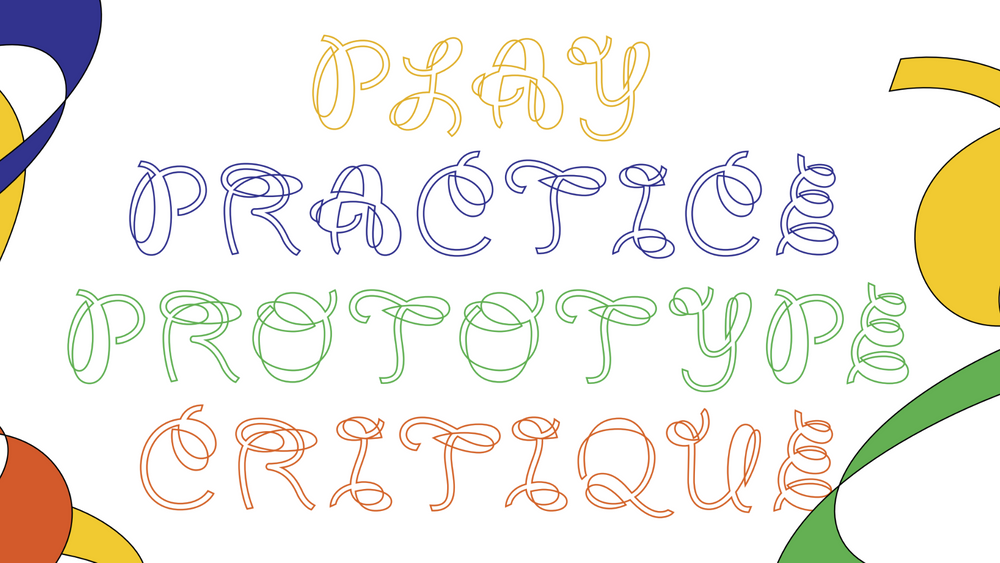 “Confetti” typeface, designed by Goeun Park for the RISD Graphic Design Triennial.
Why am I here?
Before I entered RISD’s MFA program in Graphic Design, I taught high school English. This job required many things: lesson planning, endless grading, relationship building, and emotional exhaustion. For me it also meant: instant-fold zines, opinions about handout readability, hopeful (but eventually underused) posters to encourage work completion, and elaborate color-coded grammar lessons.
Above all, teaching was clouded by an endless inquiry into the profession. Does my work at a Rhode Island charter school undermine union labor? Does it unfairly siphon public money away from the larger district? How might investment in technology disguise divestment from other areas? How does a school effectively integrate its student body, and how might my teaching choices better respond to diverse classrooms? How does my privilege complicate these choices? How does one remain empathetic, kind, and creative when the profession encourages overextension and cold efficiency?
After five years of contending with these questions, I went to graduate school for what I thought would be a reprieve. I imagined that the questions of graphic design would not be as paralyzing or knotty as those of K-12 Ed, that I’d now be dealing with answers.
Turns out I was wrong. Now at the end of my first semester, I have found myself hitched to new lines of inquiry, with their own anxieties and preoccupations. Though I haven’t found the reprieve I’d been seeking, the expansive, illegible, and curious experiences of this program hold a special appeal to a student divorced from a past role as a teacher.
Here, I’ve tried to trace these new threads of thought and inquiry. At points they cross, unravel, and weave together, but as a whole attempt to negotiate a way forward. They attempt to make sense of my present education.
Is it clear?
I keep circling this particular question, turning it over, typing it out, printing it on cardstock, folding it in half. In graphic design, an obsession with clarity haunts both process and product. It even haunts the critique space, where the question of clarity asserts itself even in the quiet pauses between voices.
Communication determines graphic design; this is the water in which we swim. And yet, doubt begins to wheedle its way into the creative discourse, and a nagging resistance surfaces. What if graphic design isn’t legible? What if it abnegates control? What if the designer cares little for ease, for visuals? What if design can’t be read? (Do we lose the right to curate logos, to use Helvetica? Do we lose the right to set text along grids?) More importantly, why might we want design not to be clear?
Who is this for?
In popular design culture, clients are the presumed bogeymen and women who kill the nascent avant-garde, walls against which designers fire volley after volley. Just scroll through the Clients from Hell tumblr to uncover the rich vocabularies of confusion and pettiness, contorted by exasperation. The dialectic between designer and client serves neither well; it inspires the worst of both parties, elitism in the former and dilettantism in the latter.
I doubt many at RISD would choose to couch their design decisions in imagined client presentations. And yet, I often find myself adopting a language
of concession and defense readily in crits, suggesting a self-imposed eagerness to please—just like that we might have toward a client. On the flip side of the crit, I find myself admiring and critiquing others’ works as if driven by a miniature client-homunculus, lobbing questions like: Why did you choose this color? Does this answer the prompt? Does this page number draw the eye away?
Design, shaped by a capital/crit system, is no longer a playground for voice, messiness, singularity, the expressionistic, the poetic, the illegible, the creative.
Is this what I want to make?
Elegantly serifed ad campaigns feel increasingly like allegories: object lessons in neoliberalism. A Chobani yogurt lid means something—its C’s ball-terminal signaling clarity in the gig economy. Here, bespoke typography arrives with blubbery Art Nouveau flourish—puffed-up, blustery, dandyish. A yogurt cup augers what the poet Anne Boyer calls “the fluorescent yes”— a yes given easily, thoughtlessly, with a Labrador’s goofy grin. The bowls of Chobani’s lowercase B’s announce (absurdly) late capitalism’s contours, its demands of graphic design: roll over, play nice.
Where does a design practice go, anyway?
Published in September, Oli Mould’s Against Creativity parses one possible direction. Through Mould, a line of elegant code, perfect kerning, grids, and riverless text transfigures into forms complicit with “Creative Work”— the toxic spume of the urbanist Richard Florida’s “creative class.” This is the design ethic of Airbnb, Ebay, and Uber: the wave of Silicon Valley graphics. These companies depend on a friendly visual vocabulary, one that smoothes the wrinkles of unregulated capital. Indeed, according to Mould, these companies build cleanly efficient “online architectures” to disguise their alienating cores. After all, “Airbnb doesn’t own any rooms or real estate, Uber does not have any cars on its books, and Ebay doesn’t have any warehouses full of goods.” They all depend on a sharing economy “abstracted from social life” and increasingly dematerialized; as Mould puts it, this economy “encourages us to conform to this mantra: if a small profit could be made lending our unused assets [like our cars, or apartments] to someone with an efficient idiot-proof digital system, why bother giving it away for free?” It’s up to their graphic designers to tailor this “idiot-proof” user experience, to help consumers navigate platforms that have “economized sharing.”
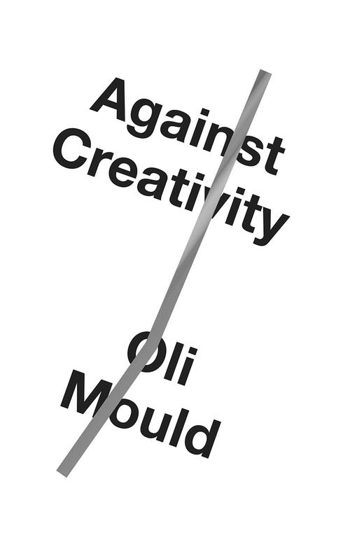
Just like the Chobani label, the bespoke typeface of Uber’s latest redesign wants to convince you. Perfect circles circumscribe the b an e, their geometry just hinting at a smiley face. It wants you to say yes to the idea of the “Creative Class”—deferring to all its legibility and even house style. To do so, however, requires (on some level) accepting an alienating model. Mould characterizes this succinctly:
Creative Work makes us all the more precarious. It reduces the need for a physical office space, in-work benefits, and long-term contracts, and intrudes into our leisure time, home life and emotional energies. In this respect, it has inherently neoliberal characteristics because it is actively destroying any form of collectivized, public and social work. Creative Work is antisocial.
I don’t like being resentful towards “Creative Work”—doing so unsettles my presence in an MFA program, in a profession that feeds this “precarious” workspace. The anxiety of modern labor already infects my “leisure time, home life and emotional energies. Instead of reading communication design as enervating, as the refinement of voice, ideas, and the imagination, I have begun to see my education as an entry into that precarious Creative Class, where Fiverr.com and other “freelance marketplaces” haunt home offices, leeching elegantly serifed type from the “creative’s” limbic system.
Or would it go here?
James Bridle’s The New Dark Age extends Mould’s discourse to the environment. From Bridle’s (at times alarmist) perspective, the cleanly designed fluorescent yes, isn’t clean at all. The “Creative Class” is not carbon neutral. There are physical stakes beyond the aesthetic when you lay a textbox into InDesign, or stitch a book, or redesign Chobani’s identity. There are servers, cables, and printers—all whirring, all hard at work.
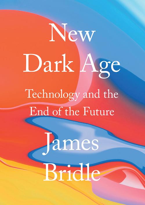
This culture produces liquid data, gushing furiously from graphic design’s spigot. Bridle likens this liquid-data to oil: “It pollutes the ground and air. It spills. It leaches into everything. It gets into the ground water of our social relationships and it poisons them. ... It sustains and nourishes uneven power relationships.” To design is to generate data, massive pulpy globs of it, all stored across expanses of server farms. According to The Independent, as quoted in Bridle, these server farms contribute “about the same carbon footprint as the airline industry.” Digital decisions go somewhere; they inhabit warehouses, they run underneath oceans.
So, here’s the rub: even as the “Creative Class” isolates graphic designers, confining them to the marketplace of the legible, it also tangles them in this digital morass. How close am I to becoming another cog in this all-consuming, ever-enticing machine?
Can I just say “no”?
Is the only reasonable response to these ethical threats to pull a Bartleby and “prefer not to?” In “No,” Anne Boyer’s essay-poem in A Handbook of Disappointed Fate, she lays out the precedence for refusal, for radical resistance, for a protean “No”:
History is full of people who just didn’t. They said no thank you, turned away, escaped to the desert, lived in barrels, burned down their own houses, killed their rapists, pushed away their dinner, meditated into the light. Even babies refuse, and the elderly also. Animals refuse: at the zoo they gaze through Plexiglas, fling feces at human faces.
Refusal has a history. From Dadaists to Xenofeminists, the fraught relationship of art to capital has occupied a vital role. Of late, the Walker Reader publishes essays anxiously troubling questions of legibility, aesthetics, ethics, and capital, from Erik Carter’s “Do You Want Typography or Do You Want The Truth?” to Nicole Killian’s “How Will We Queer Design Education Without Compromise?” New streams of questions. A new set of no’s. I want them to tangle my practice, to complicate attempts to be read.
How do we move forward?
The 2018 RISD Graphic Design Triennial ran from October 4th to the 14th, a ten-day blip compared to the three years of work it collated. The exhibition acted as parentheses, bracketing off an education’s fluid aesthetics and beliefs between 2015 and 2018. Which is to say, the show confronted the anxieties animating contemporary design. The curators, Joel Kern (MFA GD 19) and Goeun Park (MFA GD 2019), parsed legibility while resisting “being read.”
Inevitably, the intention to catalogue, to collect, to cohere lays bare all shambolic attempts at clarifying gestures. Kern and Park organized the show around four terms (Play, Critique, Prototype, and Practice) but they become porous immediately. The words themselves—set in a looping half-cursive typeface designed by Park, called “Confetti”—seem on the verge of blowing away, ribbons caught in the breeze.
Less celebratory and more unspooling, the letterforms’ strokes (overlapping and splitting like hairs) inject an additional looseness. “Confetti” demands metaphor: apple peelings, teepeed houses, shredded paper, loose spaghetti, slinkies. Each of these images share a diaphanous character. They relish counter-form and absence, a dissent from “commodity fetishism,” from the Chobani yogurt lid, and from bespoke rebrands.
The character of the type extends to the exhibition catalogue, a compilation of booklets, zines, folded newsprint all serried together in a sandwich bag packed with black-and-white confetti squares. Anxiety hums behind the shapes and letters, a tinnitus of maximalism. Geometric forms, gradients, photography, pattern—every component of the GD tool bag spills onto the catalogue pages. Student essays nestled into designed images nestled into zines.
The designers dodge and hedge, shuffling off closure in favor of the quixotic. They want the Triennial-goer to discern a hierarchy, all while continually squinting for meaning. In other words, this baggy of catalogues is not meant to convince or persuade. It’s meant to unsettle, annoy, grate—a fact made obvious by the inclusion of literal confetti. Whenever one reopens the package, little squares plume outwards, a modernist grid littering every surface, sticking to not only the page but skin and fabric too.
One can reasonably hitch themselves to a reading depending on their position and interests. But, is this the right reading of this show?
What have we done?
To the left of the fireplace in the largest gallery space, the curators hung Emily Scherer’s (BFA GD 2017) WHAT HAVE WE DONE?. The 2017 work was posted to the windows of the Design Center following the election of Donald Trump. At the time, walking downtown, I remember understanding the referent immediately. The work wanted both to indict and connect, to make sense publicly. The question was rhetorical, bitterly knowing the answer. Now, recast as a poster in the Triennial, the question seems to refer to something else—to the institution, to an education, to the design in the show, to legibility, to liquid-data, to clarity, to capital, to art, to design. What have we done?
What do I do next?
Tomorrow, I’ll face a new wave of assignments with new rules and expectations. In response, I’ll think of Anne Boyer’s “Questions for Poets”:
Every poem
until the revolution comes
is only a list of questions
So mourn
for each poet
who must mourn in their verse
their verse.
Throughout this semester, I’ve found myself “mourning” graphic design in my own verse, struggling to untangle a new (and often confusing) education. It’s a similar mourning to that of teaching: one forward-looking, hopeful, and responsive but also skeptical of clarity. The clearanswer, the silver-bullet reform, remains subject to a raised eyebrow.
And yet, I anticipate what’s to come, the next semester. Might I braid myself into a new thread of inquiry?
Everett Epstein hopes to leave RISD with no definitive answers.